“Imitation is the sincerest form of flattery.” So the saying goes. But when that imitation becomes a direct lift of concept and content, is it flattery or is it something else? This question is begat with a new ad for an organization called GrassIsNotGreener.Com, who recently ran a full page ad in The New York Times to caution against widespread legalization of marijuana, and protest recent supportive editorials.
The ad uses a headline comprised of the two words “Perception” and “Reality.” [If it sounds familiar, you’re probably over 40 years old and in the marketing business. More on that in a moment.]
Cleverly art directed, the “perception” typography sits adjacent to an inset head shot of a semi-cute 20-something long-haired bandana-wearing stoner dude with a 2-day scruff (just long enough to denote slacker, but too short to pass for intended hipster stubble.)
The “reality” typography sits two inches below, and we see that the main image of the ad is that of a power-suit sporting corporate executive at the head of a board room table. The obligatory wristwatch, broad single Windsor, a rocks tumbler filled with spring water, and the latest quarterly earnings report comprise the modest styling of the shot.
The copy is strong, and gets to its points quickly and clearly. Not a word wasted, and they took a firm shot at The New York Times along the way. They’re also borrowing a lot of negative equity from the tobacco industry, which is also hinted at in the copy.
All in all, this is a very good ad. It says, “hey…you think this one thing, but there’s another really important thing going on that you may not be aware of…so we’re here to make you more aware.”
Here’s the problem: it’s using a creative concept that’s been done before. And when I say “using,” I mean, damn-near-exactly DUPLICATING a creative approach that was done some 30 years ago. What further complicates this issue is that it wasn’t some obscure little creative execution that no one saw…this was a campaign (props to Fallon McElligott as they were known at the time,) that appeared in Advertising Age, among other publications, ran for a decade, won every major award known to man and other species, and was wildly successful for its client, Rolling Stone. (To add further props, it was a b-to-b campaign, a category in which people are still arguing “you can’t be super creative.” Right.)

[In case you’re interested, GrassIsNotGreener.com is supported by a group called ProjectSAM, [which stands for “smart approaches to marijuana,”] founded by former government officials and comprised of several medical, legal and volunteer organizations.]
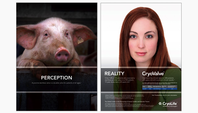
But wait…there’s more. It’s not just that this ad directly lifts this concept. Boyd Communications, based in Shrieveport, LA, used the same (exact) concept for their client CryoLife to demonstrate that most people’s perceptions about age and cardiac valve transplants are wrong. Does it work to crystallize the point? Yes, extremely well. And while there’s nothing new under the sun in advertising, they could have used that helpful, “hey there’s more to know about this subject” approach without using the same exact words, no?
And it’s not like this hasn’t happened before over the last 100 years or so – it has, countless times. Big popular executions and little-known local work gets riffed on and ripped off all the time. Sometimes it’s intentional, and sometimes, strong ideas simply resemble each other.
Advertising – especially creative strategy and execution – is about finding an effective “way in” to consumer perceptions. So when that way in has been paved on the efforts and talents of someone else, is that cool? I’m not sure. But when you use the exact same words, for the exact same ends, that is to say, when your creative is actually re-creative, we may have to start asking the question “what’s the compensation package for credit?”
