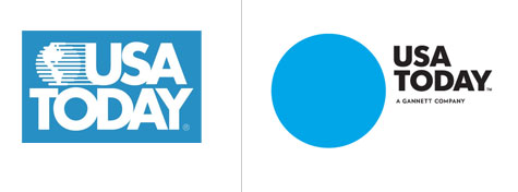
Gannett recently announced that USA Today would be rolling out a new logo system (that I have mixed feelings about.) As far as an identity system goes, this one is really simple, in that it has a very basic graphic structure, (a blue circle with black type, set in Futura caps,) and then changes color and sometimes adds icon treatments to meet the news it will identify. A big blue dot for news, a big green dot for money, red for sports and so on. The team that created it (Wolff Olins in New York) have also developed interesting methods to contextualize each section with icons that identify and categorize the story. Such as a Capitol building protruding from the blue circle for political news, or a cruise ship in the aqua circle to identify certain travel news. See the spoof that Stephen Colbert did on this aspect.
But there’s a “but” here. An intensive graphic redesign is cool, but the BRAND itself is still the same: USA Today is still a daily national paper (with no Saturday/Sunday service,) written by the same people, delivered with the same editorial agenda. So to be clear, USA Today has redesigned their logo and identity system. Not their brand.
Some other logo redesigns for major brands have had met with mixed reviews.
A Gap in Understanding
About two years ago, Gap saw a major backlash when it first introduced a new logo, and then, upon nearly unanimous derision, attempted to crowdsource a better one. Neither idea worked, and so Gap simply reverted to its original (and largely accepted) blue box. The entire process took less than two weeks. As Jon C. Ogg pointed out on the 24/7 Wall St blog, “after looking at the new logo versus the old logo, there may be more noise than news here. The old logo is not what brought buyers into the stores…the same can be said about the new logo.” Excellent point.
Here’s the similarity to the USA Today case study: Gap jeans didn’t change. (Although there were some press releases about “new designs,” but they launch new designs practically every season.) Neither did the website. Neither did the in-store experience. Neither did the cotton used to make the denim. Just the logo.
Where’s the Juice?
Tropicana heard a similar uproar back in 2009 when it launched a new logo and redesigned its line packaging. Again, the goal was well-intentioned. As with Gap, the executives at Tropicana were simply attempting to contemporize the look of the brand (note, NOT the brand itself,) by using a more modern typographic approach and by adjusting the packaging to a new and streamlined system.
The ink on the Tropicana redesign was barely dry before executives agreed to discontinue it and return to the “classic” look. All tolled, it took about six weeks to make that decision. [Sidebar: As social media channels proliferate, consumers have a powerful mechanism for voicing their opinions – and the suits are indeed listening.] Note the familiar theme here: Tropicana did not change their oranges, or their orange producers, or their distribution strategy. They simply updated the logo, got snubbed, and reverted. The brand never “changed,” and yet there may have been considerable damage done to its overall perception. See how important this stuff is?
A Penney for Your Thoughts
JCPenney, on the other hand, is quite different from these examples in that the logo evolution is also directly linked to a complete brand overhaul. Ron Johnson, the relatively new CEO, has instituted sweeping changes in the entire EXPERIENCE of JCPenney: its pricing standards, its advertising practices, its in-store display and merchandising techniques and more. In this case, the logo overhaul does seem to make sense. The mark (as a representation,) is the vicar of a new era of JCPenney as a brand.
Sadly, though, the early reports for JCPenney are not encouraging: same-store sales are down, the stock price is down, consumers are generally confused about what JCP is doing. But I wouldn’t bet against this one: unlike the other examples, JCPenney has taken the entire bull by the horns, where it seems that Gap, Tropicana and USA Today may fail in that those companies are just grabbing hold of the bull’s tail.


A well done discussion on brands and identity. Really enjoyed this one. I just wish some of these companies had the courage to stand by their conviction, regardless of what the public thinks. That behavior says more about the brand than the logo.
LikeLike