Have you heard about Google’s new logo? Of course you have. Because it’s EVERYWHERE.
But this new logo thing is nothing new at all, at least not from Google. In fact, in their roughly 18 years as a company, Google has had seven different logos. And if you consider that one of them lasted for 11 years, it’s an indication that the brand has evolved about as chaotically as the company itself has expanded.
In 1997, Google created a less-than-stellar logo by NOT using a drawing program, but rather some server-side type distorter:
![]()
Eeek! So Sergey Brin, being the bloody genius that he is, took it upon himself to design something a little more serious, and naturally, using an open-source platform. This is the 1998 version:
![]()
Better. Wheeew! But still not great. And with Yahoo! being the tech-company-of-the-month for a bunch of months, Google decided an exclamation point would really seal the deal. The short-lived 1999 version:

Not so much. Luckily, Google got serious and hired a professional. Designer Ruth Kedar designed the next version of the Google logo, and it finally had some lasting power. The version that lasted 11 years:

Nice. A bit more serious and refined. Yay designers! In 2010 (the start of the first mobile revolution – just kidding, that hasn’t happened yet in this country) they softened the logo’s dimension and shadow, but it’s essentially the same mark:

That was 3 years or so. Then in 2013, they went for the full “flat design” expression with their last version before this week’s rebrand:
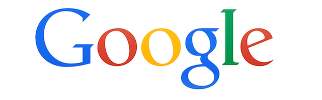
And now, after 16 years of roughly the same mark, (and not coincidentally on the heels of the whole Alphabet holding company thingy,) they have done away with the serifs and evolved into something different, but still Google-ish:
Whatever your tastes, it’s clear that the mark is evolving with the times. But this time around, they’re using the brand evolution as a stand-in for some pretty significant outbound marketing. If you look at this video, you’ll see it’s hardly a “we’ve got a new brand” announcement. This is a good, old-fashioned “here’s what we do” commercial in disguise:
“We’ve got voice commands. We’ve got real-time traffic. We’ve got a zillion ways to parse data to make your life easier! Oh, and we own that Android thingy too.”
The moral of the story:
One of the challenges that a big, established brand has – and you wouldn’t think there would be many – is that it becomes harder and harder to convince people (your clients and prospects in particular,) that you have anything new or fresh to offer. They understand who you are, they get things from you, and have come to expect that thing from you at a certain quality and consistency level. And sadly, you only get noticed if you under-deliver on that promise.
Rebranding, in some limited cases, is a great excuse to have new conversations with your current clients about what you do and where you’re going. It’s also a fantastic way to alert prospects that you’re evolving and maybe work your way into some new and exciting dialogue. But be careful! Lots of “brand evolution” and “logo redesigns” should be considered very carefully and executed with great caution. Do it too often, and you’re a schizophrenic company nobody wants to deal with, because there’s an undertone of “we can’t get our shit in one bag.” Wait too long to do it, and you’re a dinosaur that can’t compete. It’s not easy, this brand stuff.
Although Google, as an entity, is a bit impulsive – like a short-attention-span-kid-in-a-bright-colored-technology-candy-store – they typically do the macro things very well. This rebrand-as-outbound-marketing-in-disguise? I think it’s working. And I think there’s more to come yet.
[Special thanks to Ashley Feinberg and Gizmodo.com for background information on Google’s logo evolution.]

I knew there were multiple Google logos over the years Nader but seeing them morph over time is a rather unique perspective. But I thought you were going to write about Alphabet? 🙂
LikeLike
This is a beautiful example of the development of the Internet itself – starts off all “we have no idea about what it takes to look good, but hey look at this crazy thing we did”. Moves to “no we’re actually serious, this crazy thing is worth paying attention to”. Then “we’re at least as serious as that other stuff you pay a lot of attention to”. Followed by “see we told you so, now that we’re a part of your everyday life we can drop both the “!” And a million bucks to change our typeface. P.s you’re still so used to seeing flat green text on black screen that curly font, shadows and highlights are pretty amazing eh?. Then: “ok we’re all grown ups, the shadows are visually excessive, they’re gone”. Then: “ditto for highlights”. Then: “this is about as perfect as it ever gets and frankly a part of your mindset”. And finally “we’re just going to mess with this to get your attention and your money and we’re so part of everything you do that whatever we do with it you’re just coming along for the ride…bwaa ha ha ha!”…personally I liked the non-vertical axis for the letter-holes and have always preferred serif to Sans- but I’m pretty sure I’ll still keep googling!
LikeLiked by 1 person