Cracker Barrel and the logo fiasco: the real lesson.

In case you’ve been away on Mars for summer vacation, Cracker Barrel announced a rebrand, social media erupted, Trump tweeted, and within days they reversed course and went back to their old logo. But here’s the spoiler: this was never really about a logo. It was about who controlled the story.

Okay. Now you’re caught up. How was Mars?

Cracker Barrel before and after images

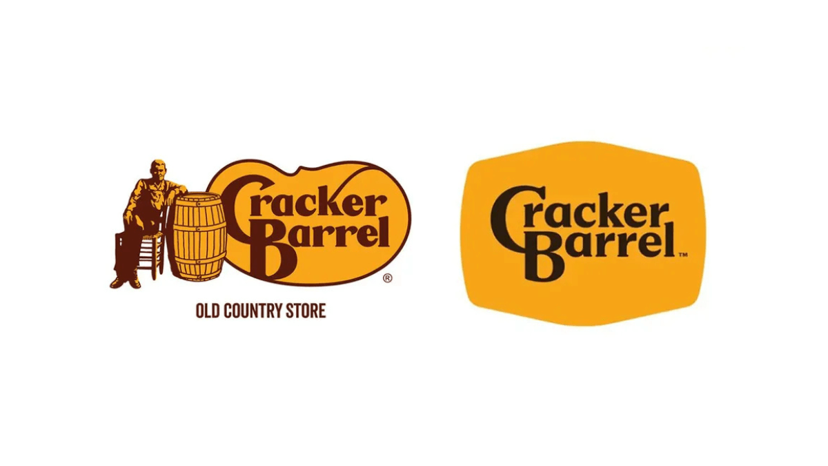
First things first: let’s not romanticize the old Cracker Barrel logo. We can all agree that thing was crap. Overly fussy, hard to reproduce at small scale, and more nostalgia than any semblance of valuable visual communication. It screamed 1970s “down-home” branding, which is exactly when it was born. The barrel-and-guy part was never sacred. Losing him wasn’t tossing a Picasso into a garbage can, it was shedding a dated illustration that had long outlived its usefulness.

The new logo? From a purely graphic standpoint? Decidedly better. Cleaner. Contextual. Legible in digital environments. A mark you can actually scale to an app icon without losing the plot. Any competent designer will tell you it was an upgrade. And yet here we are, watching the company scramble back to Uncle Herschel after a week of torches and pitchforks from the social media mob. “REDOS WILL NOT REPLACE US.”

Here’s the thing most people—including, notably, the president—missed: the logo was just one element of a much broader brand storyboard. A great new color palette. Revised typography. Shapes that make sense, including the central-focus barrel outline. Cracker Barrel’s leadership wasn’t trying to erase “heritage.” They were trying to refresh a rickety old brand with a comprehensive strategy aimed at the next two decades or so. This included remodeled restaurants, a reworked menu, more efficient kitchens, and a retail rethink that included some pretty nifty new packaging. They wrapped it all in a central theme called “All the More.” They weren’t just drawing a new wordmark; they were attempting a strategic modernization across the board.

Cracker Barrel brand story board image

And the strategy surrounding this brand refresh was sound. Cracker Barrel’s real problem wasn’t just an outdated logo…it’s an aging customer base. Julie Felss Masino, the CEO, even said it out loud on Good Morning America: “Cracker Barrel needs to feel like the place they (their audience) want to be today, and tomorrow.” The backlash to the logo redesign, of course, is all about holding on to yesterday.

The heavy blowback wasn’t about typography or colors or shapes—it was about identity politics. For some, any change to anything in America equals “woke.” For others, evolution is just common sense. The logo became a proxy fight in America’s culture war, which is ridiculous but inevitable in 2025.

And here’s the rub: no matter what side you’re on, Cracker Barrel comes out on top. For two weeks, the entire country was talking about Cracker Barrel. Lead segments on national news programs. Graphic designers guesting on CNN. Let me repeat that: Cracker Barrel. A brand that hasn’t been relevant in a national conversation since, well, ever. As I wrote in a recent post: the conversation is the campaign. Millions of people who hadn’t thought about hashbrown casserole in years suddenly had strong opinions about a roadside chain’s logo. That’s brand oxygen you can’t buy.

Let’s also not forget that this was not the first time the Cracker Barrel logo has been updated. It’s gone through multiple tweaks across its 50+ year history. Brands evolve their marks based on strategic direction, but also on design trends and the zeitgeist. Burger King did. Pringles did. Pepsi has done it enough times you could write a doctoral thesis on their logo alone. Logos aren’t museum pieces; they’re tools that adapt to the times, the mediums, the audiences, and the brand strategy.

Cracker Barrel logo evolution image

So, what actually is the Cracker Barrel brand? Here’s the core: folksy and casual roadside restaurants, easy to find off the interstate. They serve good, abundant food quickly, at a reasonable price, wrapped in a veneer of “Americana” hospitality. The real differentiators are iconic: the country store you pass through, the rocking chairs out front, and that peg game on every table that challenges your executive functions before your cornbread arrives. None of that has changed. The identity and experiences and memories that actually create the Cracker Barrel brand remain untouched.

So let’s get to the real lesson here. Cracker Barrel’s problem wasn’t that the new logo was good or bad or different. The problem was that the storytelling around its release got hijacked by everyone with a social media account. Everything else – the nostalgia equity, the politics, the stock prices – those were just symptoms. And because of those symptoms, they caved to the noise with a wimpy “we listened” statement just days later.

Cracker Barrel let themselves get dragged into a culture war, and they blinked. Brands should evolve. They must evolve. But evolution requires courage and clarity of communication. Without it, you wind up explaining why Uncle Herschel is back on the porch in your crappy old logo. And here’s a billion-dollar question: now that you’ve reverted back to the old logo, are you stuck with it forever? Will there EVER be a time when updating it is appropriate? 2026? 2030? As it relates to evolving in ANY way, the company has made it increasingly difficult for itself with this slippery precedent.

For the record, I think reverting to the old logo was a mistake. It ceded the narrative to the loudest voices and undercut the logic of the broader strategy. Now the 21st-century brand experience is saddled with a 1970s logo. That mismatch doesn’t just look awkward—it confuses customers. And confusion at the brand level eventually shows up where it hurts: at the cash register.

American Eagle and Sydney Sweeney: massive marketing mileage from meh advertising.

American Eagle Sidney Sweeney advertising image

A lot has been made over the recent American Eagle ads, called “great jeans,” featuring the actress Sydney Sweeney. And the question is, of course, why?

The advertising itself is pretty meh. And that’s not a knock on the creative or production teams. I just mean it’s super simple, mostly one-shots, no effects, no music bed, etc. Just stripped down actor-on-screen-reading-lines stuff. And Sweeney demonstrates no range as an actress – it’s almost a staged testimonial. The “big idea” was leveraging a pun on the word “jeans” to overtly imply “genes.” Okay, not earth-shattering, but not altogether a terrible way in.

It also affords American Eagle the opportunity to call their product line “great,” under the auspices of the pun construct. And the spots (there are at least four :30 versions, including one where she is shown auditioning for the part,) are simple showcases for her body shown in double denim. I’m much more surprised that the blowback wasn’t from the fashion police. Eeeeek!

Sweeney’s primary appeal, to put it kindly, is not in her eyes, nor in her hair (which was almost purposefully styled to look un-styled for these shoots,) nor is it her vocal fry let-me-be-sultry half-whispers. But that appeal was hardly leveraged in any of the spots. So it’s not overtly sexualized.

And any comparisons to Brooke Shields’ turn in Calvin Kleins from the early 1980’s are unwarranted. Sure, the American Eagle ads may be derivative, (attractive young woman alone, lying on the floor, talking directly to camera in and about her jeans,) but Shields was an akimbo nearly six feet tall 15-year old uttering lines that she probably didn’t fully understand to be as provocative as they were. “What comes between me and my Calvins” is far more suggestive and dangerous than a nearly-28-year old independently wealthy, 5’3” actress/producer reading a script whose impetus is a pun on the word “jeans.”

But then, there was no global public forum back in 1980 for moral critics—or heads of state—to air their grievances and/or share their hot takes. The wrong voices have taken over the conversation. And much of it is helping American Eagle get far more mileage out of this campaign than they likely would have otherwise.

In fact, were it not for social media, almost nobody would be talking about these ads, except for maybe the VIP tier of the Sydney Sweeney fan club. On one hand, you have some virtuists (not a word, but if Shakespeare can do it, so can I,) calling one of the ads “racist” and “eugenics signaling” (not kidding) because Sweeney refers to her jeans/genes being blue. (And because she’s Caucasian. And has blonde hair.) Nowhere in the script does it say anything about that making her superior or preferable. You want a script gone awry? Try on Dove’s “white is purity” debacle from 2017. Oooof.

Are there legitimate concerns that AE is showing a skinny white girl in their ads, instead of someone of color, or someone who is more representative of the average American woman in terms of size? Perhaps. According to multiple—and conflicting—sources, the average woman’s jean size is somewhere between 12 and 16. AE chose to ignore that, and opted instead to feature a size 2 or 4 Sweeney. They did it not to be exclusive, or dismissive, but to capitalize on her ascendant stardom and her significant influencer status as a social media personality with a hefty following. The ads are neither racy, nor racist. They’re just aimed at the average/likely American Eagle consumer, who happens to be young-ish and caucasian-ish, and probably identifies with or admires Sweeney in some way.

I also like that American Eagle responded to the criticism. An Instagram post from the brand reads:

“ ‘Sydney Sweeney Has Great Jeans’ is and always was about the jeans. Her jeans. Her story. We’ll continue to celebrate how everyone wears their AE jeans with confidence, their way. Great jeans look good on everyone.”

[Sidebar to all social media community and brand managers: note how the focus is more on the category (jeans) than it is on the brand (AE.)]

In many ways, the conversation has become the campaign. The advertising was just the spark that lit the fire. While that’s exciting, it’s also impossible to control…so AE ought to enjoy this, and be sure to not add any additional accelerant.

Is there a moral to this story? Is there a story in this story? I think so. But it’s far less complicated or sinister than most are making it out to be. I think American Eagle shelled out a lot of money to hire Sydney Sweeney, did some OK advertising, and has gotten tons of marketing mileage out of this, in just over a week. In our business, that’s a big win. And no matter what you do when you’re advertising, you will never please all of the people all of the time.

But remember. American Eagle is a for-profit apparel brand. And their target audience is not (and never was) “all of the people.”

X. Why?

This week, Elon Musk unceremoniously revealed the new brand name (and Unicode character logo, more on that later,) for what used to be Twitter. It’s simply called “X.”

And bye, bye, birdie. That most recognizable icon that adorns hundreds of thousands of websites with social connectivity, is now a part of history. And I have questions. Chief among them, of course, is why? Why take one of the world’s most popular, most recognizable, most iconic brands and just…dump it? Let’s explore.

The idea behind this seemingly rash decision is Elon Musk’s desire – and corporate directive to new CEO Linda Yaccarino – to transform the company into an all-in-one life management platform. A site for music, video, messaging, even banking and personal payments. (A super-app platform like that exists already. It’s called WeChat, and it disregards any semblance of privacy for its mainland China users. Sigh.) His contention, and I’m guessing here, is that people only see Twitter as a messaging platform, and that, in order to see it as something new and bigger, the name had to change.

But that name, and everything associated with it, had immense value. So much so that Elon Musk is reported to have paid roughly $44 billion for it. I’m no finance expert, but if you pay that much money for something, it’s because you think it has, or at least will gain, significantly more value over time. Okay, that’s a clear concept. But then you don’t change the name of that valuable thing into something banal and unrecognizable, right? RIGHT?

Twitter – whether you liked it or not, or used it or not – was a wonderfully integrated conceptual framework of idea, artwork and practical application. (And yes, I’m deliberately using the past tense here.) At the time it was developed, the idea was probably that everyone has an opinion and could chime in, er, chirp, er tweet that opinion anytime they chose. And other people could tweet. And pretty soon, everyone is all a-twitter. And so you represent that interactivity concept with a lovely little logo of a blue singing bird and it all fits together so well. A few years go by, the bird is everywhere, some big names use the platform and big things materialize, and suddenly you have a brand worth billions. And it’s represented sensibly.

Twitter – and tweeting – had become a generic term in our vernacular. So-and-so just “tweeted.” Or “re-tweeted!” There’s value there. Like when someone says “just Google it.” Or I need a “Band-Aid.” When your trademarked name becomes a verb in the English language, it likely has amassed considerable value in the process.

And speaking of value, Aisha Counts and Jesse Levine wrote in an article on Time.com, “Musk’s move wiped out anywhere between $4 billion and $20 billion in value, according to analysts and brand agencies.” This is equity that the brand took 15 years to build.

Say what you will about Elon Musk, but he has never seemed like a follower. Yet, it does seem to be a trend in the mega-tech space to dump equitable brands for less stellar superbrands. Google is now Alphabet, although Google still exists. Facebook is now Meta, although Facebook still exists. But by all accounts, Twitter is going away. It’s not clear yet if the url twitter.com will be forwarded to x.com or something similar. But there has been no indication that X is a superbrand that’s absorbing Twitter.

Let’s also remember that Musk has a thing for “X,” calling his space exploration company SpaceX. So there’s some continuity and connectivity there. (Golf clap.) But his car company is not called CarX. That would make sense. And he’s not calling this future everything-in-one app AppX. That would make sense. But I guess if people start referring to you as a genius, making sense falls low on the list of priorities.

On the logo: The symbol itself is a Unicode 3.1 character – U1D54F – which was part of a version released around 2001. In a very simplistic explanation, Unicode is a character set (designed by a group of Palo Alto techies in the early 1990’s) to be international and multilingual, mostly aimed at standardizing software coding to render text sets and symbols in various languages. Maybe it’s Musk’s tech-geek attempt at a “universal” application? Spitballing.

At first, I thought this was another IHOB PR stunt, so Musk could grab a ton of media attention to make some kind of big tentpole announcement. But when you take down the sign at the San Francisco headquarters, it probably means you’re serious. Also he took over the Twitter account @X, and there’s a kerfuffle over that, too. Man, this is a mess.

Most analysts think this is a bad idea for various reasons. I think this is a bad idea, mostly because valuable brands are so hard to come by and cultivate and grow. And people are still going to call it Twitter, and use the generic verb “tweet” for a long time. No matter what the new billionaire genius owner wants to call it.

Facebook’s Meta transition. A mashup that proves hardware is the new tech.

Late last month, noted CEO Mark Zuckerberg announced that Facebook is changing its name to Meta, and changing its official stock ticker from FB to MVRS.  The name Meta is a shorthand for the metaverse, which is itself shorthand for an almost fully immersed online world, where people can play, work, and gather in groups in the virtual sense. Zuckerberg is betting big on building it, even though it’s been tried before. (More on that in a bit.)

That this massive shift away from one of the world’s most recognizable brand names comes amid a slew of scandals is indeed curious.  But let’s leave all the political soundbites and sexy headlines aside for the moment.  This is not about the Facebook Papers, nor about Russian disinformation, nor about Cambridge Analytica, or data collection, or facial recognition…man, they do have a lot of shit swirling around the campus out there, don’t they?

Nah, this smells like a big bet hardware play, plain and simple.

This whole Meta rename is nothing more than a cosmetic corporate restructuring that will now control Facebook and its other well-known brands, including Instagram, WhatsApp, Messenger and Oculus.  A lot like when Google changed their name to Alphabet, and rolled up all their brands, including Google itself, under the holding company.  (PS – only investors care about this stuff, and THEY still call it Google. And the stock ticker for the company known as Alphabet is…GOOGL.)

So why isn’t Zuckerberg saying that?

I have an idea. Maybe it’s because the metaverse isn’t a great idea.  Or, rather, maybe it isn’t a great idea to shelter it under the enormous loads of cash that the artist formerly known as Facebook has at its disposal.  It’s been widely reported that the year one budget is over $10 billion, and that 10,000 people, mostly in hardware, will be recruited to make it go.

When any entrepreneur wants to launch a new idea, especially a broad and ambitious one like the metaverse Zuckerberg envisions, it’s good practice to prove it can actually accomplish something on its own merits.  It’s a good practice to seek capital from investors and show milestones that prove the concept.  In the absence of that kind of oversight and objective grownups in the room that business incubator model provides, it’s just another lavish vanity project.  The Metaverse is to Zuckerberg what space is to Bezos, Musk and Branson: a vast unknown that he hopes to monetize.

And let’s remember two important things about Meta’s metaverse:
First, the road to the metaverse was paved by Second Life way back in 2003, a full year before Mark Zuckerberg’s “hot or not” turned into “thefacebook.” It is a metaverse full of avatars and provides an almost identical experience to what Zuckerberg envisions: an interesting alternative online environment, where you can have virtual meetings and other whatnots.  (Kinda mostly trying to ply a virtual shopping mall, though.)

Second, and far more interesting: Meta’s virtual world will require, not suggest, that you purchase some very real and very significant pieces of hardware to access it. Oculus VR goggles are currently retailing at around $300, and may not have the full range of capabilities to access what will eventually become the Meta metaverse. It’s a long way to go to sell a bunch of accessories, but it sure sounds like a hot hardware play, doesn’t it? Build the metaverse, get a lot of good press, then tell those who can afford it that the only way to get on board is to buy some rechargeable VR binoculars, now available in six avatar-worthy colors!  All of this is coming right on the heels of Facebook (can we still call it that?) inking a deal with Ray-Ban to sell some fancy Smart Wayfarers that take photographs and play tunes, also for about $300.

If I didn’t know better, I’d swear Zuckerberg was trying to emulate Steve Jobs in some way. After all, Apple’s most successful product was/is the iPhone, not the Macintosh, its former flagship. It required the purchase of a significant piece of hardware. It was an ambitious project and came decades after the company launched. And Jobs didn’t just have the phone developed with a base OS and software.  He outsourced the smartphone “experience” to third party developers via the app ecosystem so every user could customize their device to their liking and have a uniquely personal interaction with it. It’s what ignited the phone’s insanely fast global adoption, and may be a route that Zuckerberg is similarly exploring.  The metaverse will require the purchase of significant hardware.  It, too, is an ambitious project that will launch decades after the Facebook flagship. Let’s all pay attention over the next couple of years and take notice when third-party developers – under a watchful eye and strict guidelines, of course – are invited to curate and broaden the metaverse experience in various ways, like shopping, gaming, utilities, fitness, and others.

Other tech CEOs have also profited marvelously in various ways on and off the Internet, and have pivoted to hardware in the process. Brin and Page monetized consumer intent with paid search advertising. Then they sold us Pixel phones and Google Home and acquired Nest for broader reach with devices. (And they’re betting big on Waymo.) Musk made his money online with PayPal when it sold to EBay, then monetized major hardware with Tesla electric cars. Bezos is a retailer and monetizes markup. He also likes hardware – Kindle and Echo both do just fine, thank you very much. With Meta, Zuckerberg seeks to do all of the above, just in the opposite order. He’ll first sell hardware to access the metaverse. Then he’ll sell advertising (likely highly contextualized) with a new model that combines search history, affinity, and basic demographics to a mostly Gen Z audience. He’ll build in some exchange system (maybe crypto-based) in the metaverse that costs real offline dollars. And he’ll most definitely build some kind of online shopping component.

So…what color would you prefer for your new goggles?

A clash of cultures: Twitter cancels Burger King.

A lot has been made of Burger King’s recent ad titled “Women Belong in the Kitchen.” If you’ve heard about it, you’ve likely already taken sides and are either itching to rage-tweet me, or are eager to hear someone else who supports your point of view.  Instead of taking sides, let’s be objective and unpack this thing one step at a time.

For anyone who doesn’t know, or didn’t read past the headline, Burger King was announcing the establishment of a new scholarship called H.E.R. (Helping Equalize Restaurants) to aid aspiring female employees who want to pursue careers as Chefs. The timing of its release coincided with International Women’s Day. 

Here’s the ad that ran as a full page in The New York Times:

First, let’s clarify what the ad was meant to do.  And we can do so by remembering what ALL ads are meant to do: get your attention. And this headline, while controversial if it stood alone, does that very well, because it’s dangerous. Because it’s a trope. Advertising leverages drama because it leads the reader to a destination that’s equal parts entertaining and attention-getting. And because a headline that reads “Burger King launches new scholarship to aid female representation in restaurant kitchens” is neither.  That sort of thing is for a press release, not an advert.

From a craft point of view, this is a strong headline, in that it serves to do at least one job that all good headlines should perform: it summarizes the content that follows. If we’re being objective, (and we agreed that we would be,) this is a very good all-copy ad-nouncement.

Now, let’s look at where it went wrong: in a word, Twitter. When the brand (and the agency behind it,) wanted to extend this exciting conversation online, it took to Twitter and Burger King’s 1.9 million followers with the initial tweet. Which, sadly, was just the headline. It then tweeted a summary of the content that follows in the ad. [Important note: the tweets were initially “debated” on @BurgerKingUK.] While Burger King did clarify the headline tweet in subsequent posts, it was apparently the string of ugly comments in the conversation thread that got out of control. The entire thread has since been deleted, and an apology was issued by global CMO Fernando Machado.

Ad culture meets Twitter culture and fails.  Cancel culture meets Burger King and shuts it down. This whole thing has gotten off the rails, and I think it’s mostly because people are not taking anything beyond face value. I would argue that we need a context culture more than anything else these days.  An army of fact checkers and industry experts who could act as docents for a whole generation of people who seem to crave being offended, and who magically find a fix on social media at roughly the rate of every news cycle.

The ad, the subsequent Twitterstorm, and the media kerfuffle that followed it have become new facets in the cultural touchstone that is today’s cancel-happy culture. The sad part is, it’s a pretty good ad. And Burger King, as a restaurant chain, (whether we should call them a “restaurant” or not is a different subject altogether,) is trying in earnest to do a darn good thing in the face of an inequality on which they are wholly qualified to comment. It’s a shame that we’re dealing with this level of bullshit from a minority of wokesters when a brand decides to put its money into something that might actually help in a concrete way what is, in this case, a marginalized segment of the population.

Now let’s look at what’s REALLY wrong with this ad: the typesetting is insulting, and should be cancelled immediately! The face is what it is – Burger King’s going for the retro-hip thing with the old bubble letters logo. Fine. I’ll concede that for the sake of the old-is-new branding mission.

But lord, where is the copyfitting? When the creative director was reviewing this, didn’t he or she think, “hmmm…that’s a weird place for a hyphen?” In the middle of the name of your new scholarship, in the middle of what’s arguably the most important word (Equalize,) you couldn’t break the line differently? And then again, in the last line of the ad, in another important word (kitchen) we couldn’t hard kern a little bit?

After a week of debating the merits of this approach, I haven’t heard any ad geeks talking about this.  Why? If we’re being objective, there’s probably a conspiracy afoot.