Cracker Barrel and the logo fiasco: the real lesson.

In case you’ve been away on Mars for summer vacation, Cracker Barrel announced a rebrand, social media erupted, Trump tweeted, and within days they reversed course and went back to their old logo. But here’s the spoiler: this was never really about a logo. It was about who controlled the story.

Okay. Now you’re caught up. How was Mars?

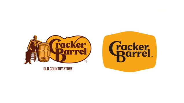
Cracker Barrel before and after images

First things first: let’s not romanticize the old Cracker Barrel logo. We can all agree that thing was crap. Overly fussy, hard to reproduce at small scale, and more nostalgia than any semblance of valuable visual communication. It screamed 1970s “down-home” branding, which is exactly when it was born. The barrel-and-guy part was never sacred. Losing him wasn’t tossing a Picasso into a garbage can, it was shedding a dated illustration that had long outlived its usefulness.

The new logo? From a purely graphic standpoint? Decidedly better. Cleaner. Contextual. Legible in digital environments. A mark you can actually scale to an app icon without losing the plot. Any competent designer will tell you it was an upgrade. And yet here we are, watching the company scramble back to Uncle Herschel after a week of torches and pitchforks from the social media mob. “REDOS WILL NOT REPLACE US.”

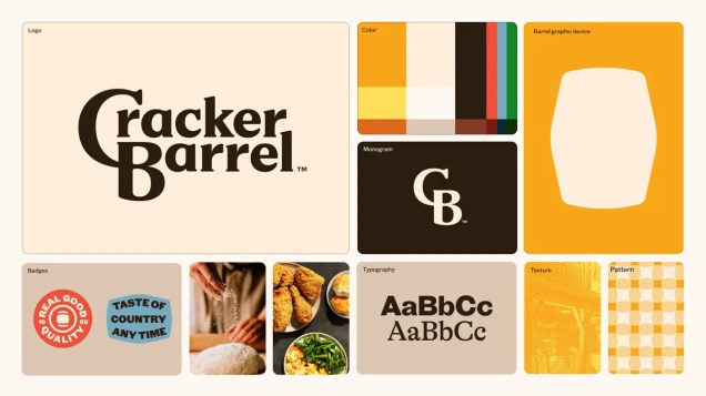
Here’s the thing most people—including, notably, the president—missed: the logo was just one element of a much broader brand storyboard. A great new color palette. Revised typography. Shapes that make sense, including the central-focus barrel outline. Cracker Barrel’s leadership wasn’t trying to erase “heritage.” They were trying to refresh a rickety old brand with a comprehensive strategy aimed at the next two decades or so. This included remodeled restaurants, a reworked menu, more efficient kitchens, and a retail rethink that included some pretty nifty new packaging. They wrapped it all in a central theme called “All the More.” They weren’t just drawing a new wordmark; they were attempting a strategic modernization across the board.

Cracker Barrel brand story board image

And the strategy surrounding this brand refresh was sound. Cracker Barrel’s real problem wasn’t just an outdated logo…it’s an aging customer base. Julie Felss Masino, the CEO, even said it out loud on Good Morning America: “Cracker Barrel needs to feel like the place they (their audience) want to be today, and tomorrow.” The backlash to the logo redesign, of course, is all about holding on to yesterday.

The heavy blowback wasn’t about typography or colors or shapes—it was about identity politics. For some, any change to anything in America equals “woke.” For others, evolution is just common sense. The logo became a proxy fight in America’s culture war, which is ridiculous but inevitable in 2025.

And here’s the rub: no matter what side you’re on, Cracker Barrel comes out on top. For two weeks, the entire country was talking about Cracker Barrel. Lead segments on national news programs. Graphic designers guesting on CNN. Let me repeat that: Cracker Barrel. A brand that hasn’t been relevant in a national conversation since, well, ever. As I wrote in a recent post: the conversation is the campaign. Millions of people who hadn’t thought about hashbrown casserole in years suddenly had strong opinions about a roadside chain’s logo. That’s brand oxygen you can’t buy.

Let’s also not forget that this was not the first time the Cracker Barrel logo has been updated. It’s gone through multiple tweaks across its 50+ year history. Brands evolve their marks based on strategic direction, but also on design trends and the zeitgeist. Burger King did. Pringles did. Pepsi has done it enough times you could write a doctoral thesis on their logo alone. Logos aren’t museum pieces; they’re tools that adapt to the times, the mediums, the audiences, and the brand strategy.

Cracker Barrel logo evolution image

So, what actually is the Cracker Barrel brand? Here’s the core: folksy and casual roadside restaurants, easy to find off the interstate. They serve good, abundant food quickly, at a reasonable price, wrapped in a veneer of “Americana” hospitality. The real differentiators are iconic: the country store you pass through, the rocking chairs out front, and that peg game on every table that challenges your executive functions before your cornbread arrives. None of that has changed. The identity and experiences and memories that actually create the Cracker Barrel brand remain untouched.

So let’s get to the real lesson here. Cracker Barrel’s problem wasn’t that the new logo was good or bad or different. The problem was that the storytelling around its release got hijacked by everyone with a social media account. Everything else – the nostalgia equity, the politics, the stock prices – those were just symptoms. And because of those symptoms, they caved to the noise with a wimpy “we listened” statement just days later.

Cracker Barrel let themselves get dragged into a culture war, and they blinked. Brands should evolve. They must evolve. But evolution requires courage and clarity of communication. Without it, you wind up explaining why Uncle Herschel is back on the porch in your crappy old logo. And here’s a billion-dollar question: now that you’ve reverted back to the old logo, are you stuck with it forever? Will there EVER be a time when updating it is appropriate? 2026? 2030? As it relates to evolving in ANY way, the company has made it increasingly difficult for itself with this slippery precedent.

For the record, I think reverting to the old logo was a mistake. It ceded the narrative to the loudest voices and undercut the logic of the broader strategy. Now the 21st-century brand experience is saddled with a 1970s logo. That mismatch doesn’t just look awkward—it confuses customers. And confusion at the brand level eventually shows up where it hurts: at the cash register.

Southwest is headed south.

Southwest Airlines current logo

Over the last several weeks, Southwest Airlines has made some big announcements. First, it announced that its “open seating” policy will be a thing of the past, now switching to assigned seating and offering premium seating as early as next year. The other doozy they just dropped (it tickled me to write that,) is that the airline will now be charging for baggage.

There were some less-doozy-ish announcements too, like making its fares available on aggregators like Expedia, significant changes to its loyalty program and a partnership with Icelandair.

This reminds me a lot of that whopper of a whiff (now I’m on a roll,) by Dunkin Donuts a few years back. (See post here.) Let that – and the subsequent parting of the ways with CMO Tony Wesman – be a lesson on self-inflicted marketing wounds.

Now, turning back to this mother of a misstep, (it just comes naturally to me,) let’s look at how Southwest was different from all other airlines. First, it did not have assigned seating. You just got on the plane and sat where you found one. Second, it never charged baggage fees. In fact, you could check up to TWO bags for free. They had a robust and passionate consumer base that preferred Southwest’s quirky, “we’re-not-like-the-other-guys” approach. It’s what contributed to the idea that Southwest was the airline “with heart and hospitality.”

As an aside, Southwest was quite different operationally as well. They chose to fly the same airplanes (interestingly, the Boeing 737, which includes the 737 Max 8,) across their entire fleet. This meant that their maintenance and mechanical functions could be streamlined for both speed and efficiency. By not serving other manufacturers, Southwest never had to wait for an Airbus expert, or contact a McDonnell Douglas specialist, if some kind of maintenance was needed on an airplane. That same efficiency carried over to sourcing parts, and buying in bulk…all Boeing OEM and likely the same third-party suppliers.

When you look at any marketing category, it’s sometimes hard to see which player has an advantage, or if any player has an advantage at all. That was never the case with the domestic airlines category: Southwest was BY FAR the most strategically well-positioned brand in the category. Those consumer-facing and behind-the-scenes aspects of the brand made the company interesting. And different. And almost entirely focused on keeping costs down for the consumer, which was always welcome news in a world where the price of everything seems to be going up, up, up, and fast.

As a result, Southwest pretty much beat the snot out of their rivals. Planes always full. Reviews always positive. Loyalty always very high.

Southwest Airlines former logo

Enter Elliott Investment Management. They’re some hot-shot hedge fund that likes to get press by “activist investing,” which is code for acting like a big baby after you buy a significant stake in a company. Led by Paul Singer, their founder and lead investment officer, Elliott purchased a roughly 10% share (about $2 Billion) in Southwest Airlines in June of 2024, and began to systematically trash the house. First they called a “special meeting” to openly criticize the CEO and the board of directors for not chasing profits. Then they forced resignations and retirements of key executives, installed their own CEO and half a dozen other cronies, all of whom likely devised these “policy changes,” like trying to wring up to a hundred bucks more out of every Southwest passenger on every flight.

So – if you want to know why Southwest would basically chew off its own arm when it had an established and defensible market position, it might simply be because some rich dude in Palm Beach wants to show the world how big his balance sheet is, legendary brand position be damned.

IMHO, this won’t end well for Southwest in either outcome scenario. If the company makes these radical changes, and it starts to deliver a profit in a year or two that would be acceptable to Elliott Investment Management, then I’ll eat crow AND they will have done so at the expense of a wonderfully and strategically differentiated brand. They’ll just be another commoditized domestic airline that consumers will shop based on slim price margins and/or if they service a particular destination. I think I’ve heard of them…JetBlue, right?

And what if Southwest Airlines does NOT show a profit? What if they lose more money? What if they become poach-able by some other airline that finds their routes and their operations desirable? Well then, Mr. Singer, you’ve killed a very successful company AND a very important brand for no good reason.

And that’s why I’m miffed in my mittens: either way this goes for the company, a really strong brand dies in the process.

Listen kids, work as hard as you can to make your brand different in some meaningful way.

Be different.

STAY different.

Even at the expense of some nominal basis points in potential additional profit.
Real brands with real positions are hard to come by these days.

X. Why?

This week, Elon Musk unceremoniously revealed the new brand name (and Unicode character logo, more on that later,) for what used to be Twitter. It’s simply called “X.”

And bye, bye, birdie. That most recognizable icon that adorns hundreds of thousands of websites with social connectivity, is now a part of history. And I have questions. Chief among them, of course, is why? Why take one of the world’s most popular, most recognizable, most iconic brands and just…dump it? Let’s explore.

The idea behind this seemingly rash decision is Elon Musk’s desire – and corporate directive to new CEO Linda Yaccarino – to transform the company into an all-in-one life management platform. A site for music, video, messaging, even banking and personal payments. (A super-app platform like that exists already. It’s called WeChat, and it disregards any semblance of privacy for its mainland China users. Sigh.) His contention, and I’m guessing here, is that people only see Twitter as a messaging platform, and that, in order to see it as something new and bigger, the name had to change.

But that name, and everything associated with it, had immense value. So much so that Elon Musk is reported to have paid roughly $44 billion for it. I’m no finance expert, but if you pay that much money for something, it’s because you think it has, or at least will gain, significantly more value over time. Okay, that’s a clear concept. But then you don’t change the name of that valuable thing into something banal and unrecognizable, right? RIGHT?

Twitter – whether you liked it or not, or used it or not – was a wonderfully integrated conceptual framework of idea, artwork and practical application. (And yes, I’m deliberately using the past tense here.) At the time it was developed, the idea was probably that everyone has an opinion and could chime in, er, chirp, er tweet that opinion anytime they chose. And other people could tweet. And pretty soon, everyone is all a-twitter. And so you represent that interactivity concept with a lovely little logo of a blue singing bird and it all fits together so well. A few years go by, the bird is everywhere, some big names use the platform and big things materialize, and suddenly you have a brand worth billions. And it’s represented sensibly.

Twitter – and tweeting – had become a generic term in our vernacular. So-and-so just “tweeted.” Or “re-tweeted!” There’s value there. Like when someone says “just Google it.” Or I need a “Band-Aid.” When your trademarked name becomes a verb in the English language, it likely has amassed considerable value in the process.

And speaking of value, Aisha Counts and Jesse Levine wrote in an article on Time.com, “Musk’s move wiped out anywhere between $4 billion and $20 billion in value, according to analysts and brand agencies.” This is equity that the brand took 15 years to build.

Say what you will about Elon Musk, but he has never seemed like a follower. Yet, it does seem to be a trend in the mega-tech space to dump equitable brands for less stellar superbrands. Google is now Alphabet, although Google still exists. Facebook is now Meta, although Facebook still exists. But by all accounts, Twitter is going away. It’s not clear yet if the url twitter.com will be forwarded to x.com or something similar. But there has been no indication that X is a superbrand that’s absorbing Twitter.

Let’s also remember that Musk has a thing for “X,” calling his space exploration company SpaceX. So there’s some continuity and connectivity there. (Golf clap.) But his car company is not called CarX. That would make sense. And he’s not calling this future everything-in-one app AppX. That would make sense. But I guess if people start referring to you as a genius, making sense falls low on the list of priorities.

On the logo: The symbol itself is a Unicode 3.1 character – U1D54F – which was part of a version released around 2001. In a very simplistic explanation, Unicode is a character set (designed by a group of Palo Alto techies in the early 1990’s) to be international and multilingual, mostly aimed at standardizing software coding to render text sets and symbols in various languages. Maybe it’s Musk’s tech-geek attempt at a “universal” application? Spitballing.

At first, I thought this was another IHOB PR stunt, so Musk could grab a ton of media attention to make some kind of big tentpole announcement. But when you take down the sign at the San Francisco headquarters, it probably means you’re serious. Also he took over the Twitter account @X, and there’s a kerfuffle over that, too. Man, this is a mess.

Most analysts think this is a bad idea for various reasons. I think this is a bad idea, mostly because valuable brands are so hard to come by and cultivate and grow. And people are still going to call it Twitter, and use the generic verb “tweet” for a long time. No matter what the new billionaire genius owner wants to call it.

For brands – and for revolutions – words matter. Why “defund the police” is the wrong message.

defund_police_image

I used to have a daily calendar with pithy sayings, and one of my favorites, attributed to French moralist Joseph Joubert, read:
Words, like eyeglasses, blur everything that they do not make more clear.

Over the last several years, we’ve been confronted with a lot of words that reflect our social, political and racial realities. “Me Too.” “Time’s Up.” “I Can’t Breathe.” And now, “Defund the Police.”

As an observer, I see everything through the lens of marketing. And the disciplines of branding and advertising rely almost entirely on one key element to help reach human beings and manage their perceptions of the world: language. Language is how you convince. Language is how you compete. Language is how you win.

Language is what helps companies communicate IDEAS. And more specifically, language, when used correctly, communicates only the ideas you need to convey in order to shift or change perception.

Some context: in the famous cola wars, the soda brands Coke and Pepsi were duking it out for decades to convince people that their brand tasted better than their rival’s brand. The governing idea was that “people drink one soda or another based on the taste.” When Pepsi (and their 1984 ad agency, BBDO) rolled out the new slogan “the choice of a new generation,” it not only caught Coke off guard, it also worked to generate a huge shift in Pepsi’s favor.

It worked because it shifted the conversation away from the idea of the flavor profile of some caramel-colored carbonated sugar water towards the idea that the individual that drank it actually mattered. And the language was very clear that the lines would now be drawn on the basis of age and attitude, (youthfulness in particular,) and not taste.

There are other examples, like Folgers Coffee’s slogan “the best part of wakin’ up is Folgers in your cup.” Sounds like a simple rhyme, right? But what’s actually going on is the brand driving a stronger association between coffee and mornings, which is when most Americans drink their coffee. That’s language working the idea.

Then there was the famous “the other white meat” slogan from the Pork board. As American consumers were worried about heart health, red meat became public health enemy #1. Pork pivoted (never thought I’d write those two words,) and in 1987 hired Bozell, who devised this tricked-up language to associate pork with what consumers deemed healthy: white meat, such as chicken, turkey, and fish. While pork is considered white meat in culinary terms, because it is pale in color both before and after cooking, it is (still) classified as a red meat by the US Department of Agriculture. So you can see how language can be used to blur the lines as much as reveal them.

This is true in branding. It’s also true in revolutions.

The language that has emerged over the past several days and weeks of protesting police misconduct has centered around three impactful words: “Defund the Police.”

Strong idea.
Not a great choice of words.

And we need to rethink it, because people can (and will, especially for political gain,) easily misconstrue the WORDS to conjure up alternative ideas that are likely contrary to the intent of the message.

The IDEA of “defund the police,” is rooted in what many see as a history awash in abject racial inequity as it relates to policing. But read carefully: “defund” is neither a social construct, nor a racial one. It is an economic concept. Sure, we can talk about the steady escalation of local taxes and state budgets around policing: more funds for newer technology, vehicles, weapons and tactics that create what looks like a more “militarized” police force, even in Smalltown, America. But that’s not entirely why people are marching.

While a small percentage of people will stand behind the idea, I doubt that most protesters or demonstrating citizens would actually vote to actually defund the actual police with actual economic policy. But because the words themselves are not quite perfect, and so packed with far-reaching implications, it’s hard to have any constructive conversation around them.

What many people are expressing is that they want a hard reset. On race relations. On police use of force, especially against people of color. On political pressures and police union out-clauses that protect the uniform first, and then ask questions of any weight later. And mostly, they want to feel equally protected and equally served by their police. These are not conflicting ideals. These are complex collective emotions and they seem to be shared in this moment by more people than ever.

And yes, there should be a national dialogue around these issues. And there should be some time to reflect on everything that has transpired and brought us to this moment. And maybe there should even be a new approach to policing.

But words matter. And although “defund the police” expresses outrage and communicates its own #timesup with the current state of policing against a disproportionate number of black and brown Americans, it nonetheless sounds inflammatory and abrupt. It’s hard to unite around language that is inherently blurry.

When Martin Luther King, Jr. said “I have a dream,” he chose the words carefully. Even while he mused about people being judged “not by the color of their skin, but by the content of their character,” he simultaneously acknowledged that it was, at the time, out of reach of reality. By choosing “dream,” he communicated sheer possibility alongside the harsh reality of long, hard work to come.

And since words matter to me, I’ll offer these as an alternative to “defund the police.”

Reflect. Rethink. Retrain.

In my estimation, this is what demonstrators all around the country are actually clamoring for:

  • That we reflect on the choices that we’ve made, and the errors that systemic myopia can yield, from the Central Park Five all the way up to George Floyd. (And that’s just the very recent history.)
  • That we rethink what policing actually is, and more importantly, what it isn’t. In many ways, police are in less advantageous positions to protect and serve largely because they’re asked to do too many other things that may fall outside the purview of what “policing” actually is.
  • That we retrain police and the entire law enforcement ecosystem for the jobs they’re very good at, and move away from the “broken window” policing strategies of the 1990’s, which are at the heart of some of today’s core issues.

It may also require retraining of our own expectations – and responsibilities – as citizens around policing. As an object study, read what the Camden, NJ police department did, and how local activism and cooperation, along with de-escalation training and requiring officers to intercede if another officer was using inappropriate force, finally and positively changed an entire community.

There may not be perfect language for all of this. But we can start by avoiding imperfect, incendiary and inflammatory language that divides, misleads, and impairs our ability to collaborate on solutions.

Reflect. Rethink. Retrain. It may not be perfect, but it sure does make for a good chant from a crowd marching down Main Street, USA.

Coronavirus CMO Checklist

marketing_thingy_checklist_image

As we’ve turned the calendar to another month of dealing with the uncertainty surrounding the COVID-19 pandemic, a lot of brands and agencies are wondering what’s next.  While many brands have pivoted to pandemic-related messaging (see a regularly updated list here,) most are taking a breath, and working hard to plan their next move(s.)

Believe it or not, this forced time-out can be an incredibly useful opportunity on many levels.  Whether you’re the CMO of a global brand that spends millions or an owner/manager of a small to medium-sized business that’s trying to edge out your competition on a regional level, this may be the best time to evaluate your brand and make structural moves to re-position it for success when the world wakes from its medically-induced commercial slumber.

Here’s a quick dos and don’ts checklist of items to consider while we’re all waiting for the refs to say it’s time to get back in the game:

ON POSITIONING

DO reinforce your strategic position, whatever it might be. If you’re the low-cost leader, then now is the time to forage for ways to maintain and even strengthen that position, perhaps by having new discussions with suppliers and distribution agents.  More importantly, if you don’t have a strategic position (or perhaps don’t know exactly what yours is,) you’ve now been given the gift of several weeks and even months to figure one out.  Huddle with your team – or better yet, a consultant or agency – and learn how to articulate who you really are in ways maybe you haven’t before.

DON’T waver.  If you do have a position and it helps the consumer/customer understand what makes you different, do not veer from your course.  You might hear of brands trying to “strategically pivot” into new areas and try to replicate what competitors do in an effort to grab short-term revenue gains or “narrow their gap.”  We’ll probably see a LOT of price manipulation once the markets begin to wake as competition for consumer attention will spike – but don’t be tempted.  If your position is built on quality, or prestige, or speed, or technology, or safety, or any other attribute that you can effectively “own” in the mind of the market, stay the course.  The consumer segment that desires your position will be more motivated than ever to seek it out when this is all over.

ON STAYING IN TOUCH

DO stay in touch with consumers/customers and stakeholders of all kinds. Be a friend in some way.  Be a lifeline if you can.  One of the most compelling aspects of this pandemic is the psychological toll it’s taking on people from all walks of life.  Routines are disrupted.  Rituals interrupted.  And we cannot forget that brands represent constancy and normalcy for so many Americans – perhaps the only two commodities that are in shorter supply than toilet paper. As long as your brand is reminding consumers that you’re still there, and will continue to be there to support them with what they expect of you, you should come out of this national hibernation in pretty good shape.

DON’T brag.  Even if you’re doing the most amazing things right now in your community or in your industry, no one wants to hear how great you are.  Do what you can to serve in this crucial time, but do those things quietly and let the results speak for themselves. Grandstanding is not a good look in a crisis.

ON ADVERTISING AND STAYING VISIBLE

DO advertise if it makes sense and you have something valuable to say. In my last post, I advocated strongly for advertising, and provided several reasons why it’s more important than ever.  I continue to recommend that you stay visible and adjust your messaging to take the current consumer environment into account.

DON’T disappear.  Find ways to stay relevant, even if you’re conserving major expenditures (like media costs.) This is a great time to get more social, expand or enhance your app, send timely email updates and so on.  AND DEFINITELY DO NOT use your advertising presence to take shots at competitors.  You should notice that there’s no “feuding” going on now, even among the largest brands.  No cola wars.  No chicken sandwich smackdowns.  Competitive advertising in the current climate is not only a waste of valuable ad dollars, it’s in poor taste. Consumers are paying rapt attention right now, so behave with your brand as though momma was watching you.  ‘Cause she kinda is.

ON PLAYING THE LONG GAME

DO be prepared (financially and otherwise,) to ride this situation out well into 2021.  It’s clear that some brands will falter during this time as consumers are also re-evaluating their priorities and allegiances.  Staying true to your brand ethos (and reinforcing/refining your position, see above,) can a.) cement the relationships you’ve already worked so hard to forge and b.) make you look darn attractive to those defecting from other brands.

DON’T rush your expectations.  Although confidence is virtually nonexistent at the moment, consumer motivation will be high and will likely surge for many months as the commercial rebound begins.  Expect a tentative but large wave of consumers re-entering the market with fresh perspectives and open minds.  Rushing to grab profits and short-term gains (in an attempt to recoup some recent losses) may preclude your brand from the much more substantial rewards of sustained success and new fans.