Why, Hightail?

The very popular file sharing service, formerly known as YouSendIt, has now changed their name to Hightail.  No, keep reading…I’m serious.

This is what their homepage takeover message looks like:

hightail_takeover

So the obvious question is…why?  And let me qualify that question with some color.

Why, if you’re a file sharing service, a service that allows YOU to take a large file and SEND IT to someone else (for free on the basic plan, I might add) change your name from YouSendIt to, well, anything else?

Why, if you’ve invested all this time and money for nine years in the back end cloud storage virtualized pool infrastructure, and invested in acquisitions and technological upgrades, and invested in marketing and advertising, would you change your name from YouSendIt to, well, anything else?

Why, even if you’re announcing broadening your offering from file sharing into digital file collaboration services, would you change your name from YouSendIt to, well, anything else?

Why, when there’s nine years of brand equity built up, when you’ve outlasted some pretty high profile would-be competitors, (including the flailing DropBox,) when you’ve gotten 4 out of 5 stars from PC Magazine, when you’re finally turning a profit on the premium services, when you’ve become the generic term for Internet file sharing services (literally, people verb-ize file sharing as “I’ll YouSendIt to you later,”) would you change your name from YouSendIt to, well, anything else?

It could be a number of things.  It could be new CEO Brand Garlinghouse (formerly of Yahoo!) putting his fingerprint on the company he’s been appointed to run.

It could be that YouSendIt doesn’t sound sexy or silly enough, and they wanted to sound more like Yahoo!, or Hulu, or Etsy or whatever.

YouSendIt could have done a lot of things to refresh – which they’ve done with Hightail.  New, HTML5-coded website.  New features.  New look and feel.  Heck, they could have updated the logo.

And the folks at Hightail know the name thing is an issue.  It merits above-the-fold position on their homepage with a message that says “watch this short video to learn why we changed our name.”  Yes.  Let’s:

Okay, but still, the new name thing confounds me.  In the video, you hear some of the talking heads saying things like “the name YouSendIt constrained us in terms of our vision.”  [Tell THAT to Google.]  And “we don’t want a name that holds us back.”  And my favorite “we finally have a second chance to make a first impression.”  And that’s the quote that really stands out for me.

Because here’s the dirty little secret about branding that nobody teaches you in b-school.  You don’t get a second chance to make a first impression.  You only get one chance to make one impression to one prospect at a time.  And in my opinion, Hightail doesn’t make a bad impression.  It does something far worse.  It makes no impression at all.  It confuses rather than clarifies.

Don’t get me wrong.  I get “hightail” as a verb.  “I’ll hightail it over to you.”  Or “you hightail it over to me.”  But we’re not talking about meetings here.  [Really, “I’ll hightail it over to you” means “I’ll be right there.”  Not “I’ll get you that large file right away.”  So there’s even a semantics issue. Ugh.] Plus, it’s such a hipster-cum-corporate-acceptable piece of jargon. I wonder if they’re now headquartered in Dumbo?

From a pure brand perspective, the truth is that YouSendIt was a GREAT name for a brand.  It was functional.  It was short and sweet.  But mostly, and bestly (?) it conveyed a promise (You.  Send.  It. ) which, after all, is the heavy lifting of a brand.

Let’s watch and see what happens together.

Pardon Me, May I Borrow Some Equity?

From a marketing perspective, Audi is having a strong first half of 2013. They started with this spectacular Super Bowl Spot, which I also covered in my Super Bowl Advertising Roundup.

As you can see, this spot is really strong advertising, very well executed, and by most accounts, very well received. Kudos to the team at Venables Bell & Partners for 60 seconds of fine storytelling, excellently produced.

What I really admire is the borrowed equity. Audi uses the (classic) high school prom and all its teenage-I-don’t-really-fit-in-and-I’m-secretly-in-love-with-that-girl angst as the thrust agent to propel the underlying storyline. There’s so much being said, without actually being said, that provides backdrop and motivation to the spot. In virtually any other scenario, you’d have to spend a lot of valuable airtime to establish that emotional context. Borrow some “prom” equity, and it’s built in. Smart.

Now, Audi releases another gem, a viral video called “The Challenge.” It’s a two minute and 44 second short featuring Zachary Quinto and Leonard Nimoy. For the four of you who can’t make that connection, they both share the role of Spock from the Star Trek fiction series, and this video is released just weeks before the next installment of the blockbuster film franchise “Into Darkness” is released nationwide. [Interestingly, and clearly not coincidentally, Audi is NOT the “official auto partner” of Star Trek. It’s Mazda. And they’ve gotta be pissed over there in Anaheim.] Take a look.

Again, aside from the fact that this is a really good piece of content, with a couple of really good laughs around the old man vs young turk struggle, it’s the Trekkie/Nimoy references buried in the action, the Star-Trek-ism of it all that fuels the comedic undertone. It’s geeky, and quirky, and you’re almost waiting for Sheldon from “Big Bang Theory” to make a cameo. By the way, did you notice that shameless kick in the crotch that Audi levels on Mercedes-Benz? OUCH.

In the short, there are plenty of jokes, and Nimoy even reprises his old Bilbo Baggins vocalizing as part of it. It’s camp. It’s fun. It’s for FANS. It’s content dissemination that’s approaching four million views as of this writing. Yeah. FOUR MILLION.

In both cases, Audi was smart and crafty enough to pull some strong messaging together and dress it up with sexy shots of the latest A7 vehicle. But they go a step further and deliver those messages to consumers in powerful emotional packages that ALREADY have trust and memory and gravity built in. It is indeed “fascinating,” and I, for one, can’t wait to see what they do the rest of this year.

Live long and prosper.

[This article first appeared on Technorati.]

Brands: Are they nature or nurture?

I’ve been doing a lot of talking, teaching and pitching around the concept of brands, and it seems that a lot of people – including professionals in the brand business – still have wildly differing ideas about brands and what they are.  And while this post is NOT intended to clear everything up in 500 words or less, I do think that looking at it from a different perspective will help.  So let’s evaluate brands on the simple x/y coordinates of nature vs. nurture.

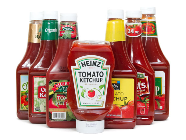
Let’s take a simple consumer category, like ketchup.  If we’re developing a NEW ketchup brand, we’d have to fit it in the market alongside the primary players like Heinz and Hunt’s and Del Monte, and let’s throw in the niche marketer Annie’s who owns the “all-natural” position.  Aside from the typical line extensions (organic, gluten-free, sugar free, etc.) not a very cluttered market at all.

ketchup_brands

The basic NATURE of brands in this category:

Ingredients
Texture
Flavor

If you were going to enter a competitor into the market, the brand would have to declare itself different by nature (a unique flavor, or a unique combination of ingredients, maybe they only source specific tomatoes, etc.) and then – and this is the important part – have to become different by nurture.

The way brands in this category are NURTURED:

Price
Packaging
Distribution
Merchandising
Advertising (national vs hyper-local)
Social Efforts
Publicity
Partnerships/Sponsorships

So we could develop a brand (let’s call it Kelly’s) and give it a certain NATURE so that it fits in the category and has a chance to carve out some market share.  Let’s suppose Kelly’s is sourced using only organic plum tomatoes from Italy, packaged in a really cool NON-plastic carton, and is frequently preferred over Heinz during blind taste tests.  (Lots of differentiation points there, and also lots of category parody.)

On its own, the brand’s nature should allow it to enter the market and do fairly well (given the right distribution.)

But here’s where you see that brands are NOT just the sum of what they’re made of.

For Kelly’s to survive – and ultimately, thrive – the real work would be in changing the hearts and minds of those who are in the market for ketchup to allow them to make “mental room” for a new player.  With Heinz owning about 55% of the market, Hunt’s about 20%, Kelly’s would be competing with Del Monte and “all others” for a piece of the remaining 25% of the roughly $1 Billion ketchup market.  At first.  But given the right climate, the right amount of time and the right combination of nature and nurture, there’s no arguing that Kelly’s could ultimately unseat Heinz for the #1 spot.

But how much would that cost, and how long would that take?

The answer lies in how the brand is NURTURED.  If the advertising is cool, and the brand selects some pretty cool partnerships and sponsorships, and doesn’t overly rely on price promotion, and does well on the b-to-b side with slotting and merchandising, and doesn’t suck, then it’s likely that nurturing won’t take too long.

However, if ANY of those things is slightly misaligned, and misperceptions ensue, then it will certainly elongate the process of adoption.

Brands are a phenomenon in two important ways.  First, they’re a perceptual phenomenon. Brands don’t actually exist.  As I’ve told my students, there’s no vault somewhere in Pittsburgh where the Heinz brand is “locked away.”  It simply exists in the minds of consumers as a sum of experiences and interactions.  And while all those versions from all those consumers are slightly different, they do share a basic collective complexion.

Second, brands are a cumulative phenomenon.  Meaning that those experiences, interactions and overall perceptions are forged over time – good or bad – and the one-word phrase that you may connect with the brand (“rich,”  “thick,” “sweet,” whatever,) gets more and more embedded over repeat impressions of that initial imprinting on your mind.

Until ultimately, brands are weighed in the moment of truth in the condiment aisle when the consumer ponders whether she wants “thick” or “sweet” or “rich” when it comes to what she’s putting on her next burger.

So – are brands nature or nurture?  Yes.
But the real work begins ONLY after you’ve gotten everything right.

Super Bowl Advertising on AUTO-Pilot?


For the most part, the super bowl spots this year were, well, less than super. No really big ideas. No breaking of any molds. No we’ll-be-talking-about-this-in-20-years executions. It’s not that they were bad. They just weren’t memorable. And in the world of advertising, if you can’t do memorable, you can’t do anything.

Let’s spare the knocks and gaffes. We all know what those were. (A kid peeing in a pool for a free online tax service? Really?) Instead, I’ll focus on the few standouts in the automotive category and see if we can highlight some themes to remember if and when you ever have the chance to put your brand on the grandest stage of all.

For my money, GM wins the night with their “2012” post-apocalyptic survival spot for Silverado. A Silverado pulls out of the gray rubble of the aftermath with every cliché in tow: a rugged middle-aged man, his trusty dog and, of course, Barry Manilow crooning “Looks Like We Made It.” Even the Transformers (yup, that’s Bumblebee’s head laying on the side of the road,) and the alien ships couldn’t outwit the Mayan foreshadowing. But Silverado did.

And in the gutsiest move of the night, GM takes on the competition by name. The main character meets up with three other Silverado drivers and asks, “Where’s Dave?” A saddened friend reports the dreary news: “Dave didn’t drive the longest-lasting, most dependable truck on the road…Dave drove a Ford.” Home run. Say goodnight Gracie. That’s all she wrote. Best spot of Super Bowl R2D2. Take on the competition by name, and kick ‘em in the ding-ding. Then share a Twinkie.  Wow.

In general, cars made the best showing as a category, but also seemed to demonstrate the weirdest strategies. Audi (with agency Venables + Bell) spent $7 million on the 2-minute “Vampire Party,” which is a neat little spot that goes a LONG way to make a point about their LED headlights, which apparently recreate daylight so well they fry vampires. I love advertising that’s singular and focused and creatively makes a point about a particular feature. So points for telling us SOMETHING about the car. (More than others can say.) But on the Super Bowl? Let’s keep it brand-ey, okay?

Fiat: fantasy about a gorgeous Italian woman with all the soft-porn of latte foam. Chevy: “stunt drivers” thing was kind of done already by Nissan earlier this year. Cadillac: let’s take on BMW on the positioning they’ve owned for more than 25 years. We know the creatives came out to play, but where was the CMO in all of these executions?

Clint Eastwood enlisted to do a tug-at-your-heartstrings-but-watch-out-cuz-I-can-also-kick-your-ass sendup for Chrysler. Okay, this is exactly the kind of thing Americans who are feeling patriotic and puffed up want to hear. And the spot is well done, and turns last year’s coming-out party into an extended affair. All good. But I think we’ve all come to expect more from Wieden + Kennedy than a reboot of the 1984 Hal Riney “Morning in America” classic.

VW also took the let’s-build-on-last-year strategy with “Dog Strikes Back,” a touching anthropomorphic vignette of a dog who’s lost his mojo. The dog can hardly chase a car anymore because he’s gotten too complacent. So he embarks on a disciplined workout regimen, resists the temptation of mom’s table scraps and gets back into fighting shape so he can hustle out the door and chase that flashy new VW Beetle down the road. Really good work from Deutsch. Nice little tag on the end to connect the dots to last year’s “Vader” spot for Passat. Another winner for 2012.

One thumb up to Hyundai for a number of reasons. They’re feeling their oats these days (and they should – their sales are killing,) so they decide to invest in some Super Bowl branding. The “cheetah” spot and the “think fast” spot (both from Innocean) weren’t feats of advertising genius, but they were solid entries into a pretty crowded field of automotive advertising. Compared to Toyota and Lexus, they were smarter. Not as funny as Honda’s “Ferris Bueller” or “Seinfeld,” but probably did more to educate viewers about the brand. And by the way, where was Ford, the company that bragged all year about not needing a bailout?

This article first appeared on Technorati.

Writing Advertising? Shorter is Always Sweeter.


Illustration:  Bruce Crilly

In the history of advertising, some of the most lauded taglines have also been the shortest.  Why is this?  (And while we’re at it, why does the leggy blonde always seem to go out with that short guy?)

Why do we not seem to gravitate to long, multi-syllabic complex thoughtforms?  At first glance, it would seem to be useful if we could pack more bullet points into our advertising signoff, so people would remember lots of stuff about our product or service.  But for American consumers, it just doesn’t work.  Maybe it’s because we’re American.  We like it punchy.  We like it now.  We like Ricky Bobby and light beer, dammit.

Okay, that’s cynical, and not so helpful.  Let’s get serious.  For the most part, shorter taglines work for a number of reasons. Primarily, its because they’re easy to remember.  And if you’re in the business of stimulating demand (that’s what advertising is supposed to do, bee-tee-dubs,) then a short, pithy line is simply more memorable, more recall-able than, say, an advertising haiku. So there’s a form-follows-function overtone there.

Second, there’s an actual meter to consider, a rhythm, a tempo, a little bounce that shorter lines provide over their more verbose counterparts.  With a short line, the consumer can file a meme away into a corner of her mind that only your brand (in the best cases,) can occupy.

Finally, it’s about time.  The modern consumer is busier than ever, and is literally overwhelmed with messages, media, and now devices that carry and deliver information, including advertising messages.  Whether it’s social media applications, or websites, or traditional media, or a sporting event, or the floor at the local grocery store, there simply isn’t time in the consumer’s day to focus on all that content – especially your bloody marketing message.  Now, more than ever, being short and to the point is not just a welcome deviation from the discord in the din, but also a way to stand apart from it.  Brevity is indeed the essence of wit.

Although this might seem confining, remember that you can say an awful lot with a few small words.  Case in point:  ‘Be all you can be.’ for the US Army.  This line lasted more than 20 years and defined perhaps the most successful articulation of any military marketing message. Five words, of two or three letters each.  And yet, the meaning is monumental.  Partly because it’s personalized to the individual reading it via “you,” and “all” is just broad enough to cover virtually every aspect of that individual’s life.  Brilliant.

Some of the most notable short advertising taglines:

Just do it.
Think Small. (This was actually a headline but it rocked so hard, it has to be included.)
We try harder.
Got Milk?
Be all you can be.
A diamond is forever.
Think different.
It’s not TV.  It’s HBO.
Intel Inside.
Priceless.
Because You’re Worth It.
Great taste. Less filling.
I want my MTV!

Putting it into practice:

Let’s not forget, there have been immortal taglines that are not short.  (The Ultimate Driving Machine/When it absolutely, positively has to be there overnight/Melts in your mouth, not in your hands, etc.) So when you set out to craft advertising for your business, keep your audience front and center, and let that dictate what you write.  What are they doing?  What do they need?  How can you help them?

Keep it simple.  Better yet, keep it short.  Pack as much into the idea that you can, without leaving too much to the imagination, (although leaving to interpretation is okay.)  Generally, basic language works best – small words, single syllables if you can help it, and a clear, declarative tone.  And NEVER make your slogan – strapline, tagline, whatever you want to call it – a question, okay?   (A really good one only happened, like, once.)

Now,  get your eraser out and start writing.